Since 1990, The New York Legal Assistance Group (NYLAG) has worked tirelessly to make the voices of individuals and families with low-income or experiencing poverty heard, and to provide the highest quality free legal services. We have expanded to include financial counseling.
This year, to honor how far we’ve come and to reflect our vision for the future, we embarked on a project to create a new logo and visual identity for NYLAG. Our goal was to create a logo that was bold, confident, unapologetic, and modern.
Why is there a line under the L?
NYLAG’s new logo underscores the L to highlight our expertise in solving legal crises for people experiencing poverty. It also is an equal sign, symbolizing our commitment to equity and equality.
NYLAG's personality
Clients and staff identified these characteristics as central to NYLAG’s identity. We used these traits to guide our search for our new visual identity:
SCRAPPY
EXPERT
COMPREHENSIVE
ADAPTIVE
CONNECTED (to the community)
EMPOWERING (to clients)
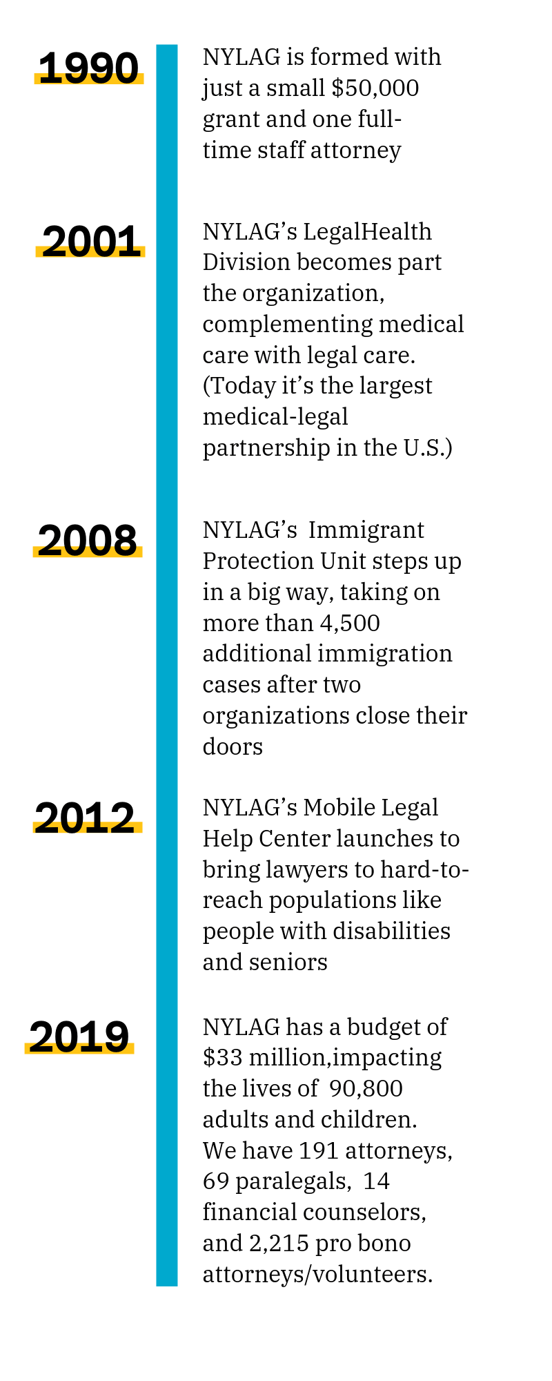
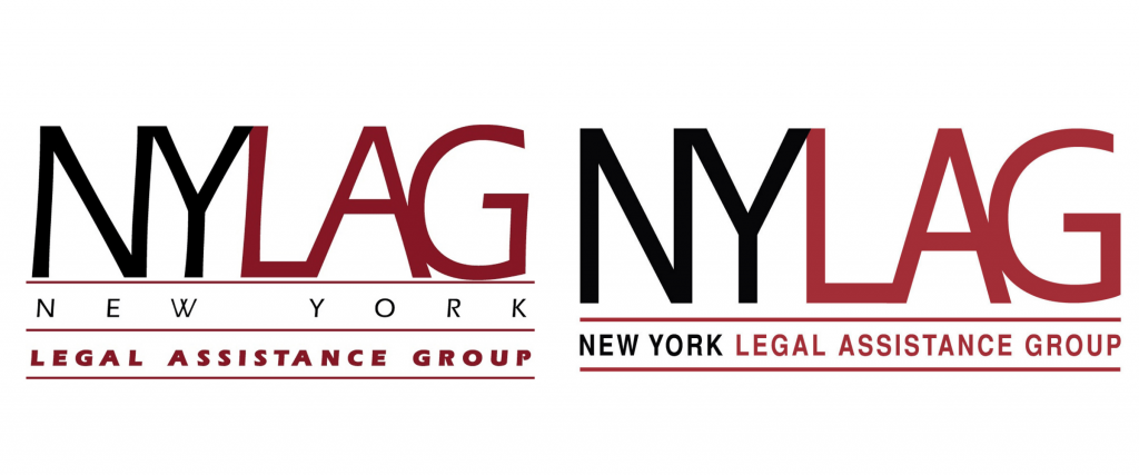
NYLAG’s previous logos are an important part of our visual history, but with the organization’s exponential growth, and the changing political landscape, it was time to strengthen how we communicate our lifesaving and vital work.
In pursuit of justice..
Our new visual identity boldly communicates that NYLAG is adaptive and responsive to the legal needs of New York’s adults, children, and families when they need us.


